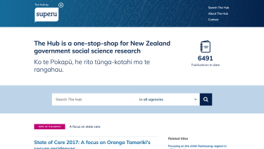
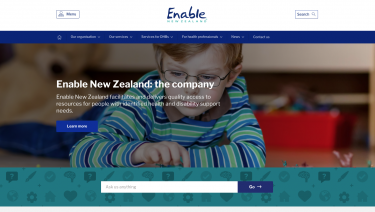
SilverStripe was tasked with revitalising HQSC's website with a modern look and feel, stripping back the content heavy site and introducing personas and identities into the build.


Project Background
Health Quality & Safety Commission New Zealand (HQSC) is an innovation and improvement centre that works with clinicians, providers and consumers to improve health and disability support services. HQSC chose SilverStripe to help reshape their digital presence through modern, clean design principles.
HQSC’s old site was a content heavy, non-responsive and no longer effectively communicated information to its visitors. The goal of the project was to declutter and modernise the site which had up to 6 levels of depth and was inherently very difficult to navigate.
Numerous workshops were held between HQSC and SilverStripe to overhaul the information architecture of the site and establish simpler user journey flows. Search was another area which was identified as being critical to helping visitors find information. Tagging and weighting search terms helped to address this.
To freshen the design of the site, SilverStripe brought in more imagery, brighter shades of colour from their brand palette, and implemented a simpler interface to the homepage, surfacing the content that mattered the most to HQSC users.


