Kohler Credit Union
by Dynamic
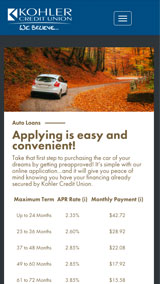
Financial institutions have large amounts of detailed factual information to share, such as rates, fees and percentages, which—let’s be honest—can tend to be a dull read, especially if it’s presented in an outdated format. That’s why Kohler Credit Union approached us to update their website. They wanted a fresh, modern look with improved navigation and a more concise, intuitive organization of information. We rolled up our sleeves and put our money where our mouth is.

Featured
Feb, 2016

CURRENT INFORMATION ON ANY DEVICE
The main update we made to the Kohler Credit Union website was a creating a responsive design with a single database that seamlessly integrates on desktop, table and mobile versions of the site. A fresh look that’s crisp, clean and modern appeals to both previous users and potential customers. We also designed the site with a centralized location that allows the credit union to update rate changes that populate on multiple pages.
2015 MARCOM AWARD WINNER
Dynamic’s website redesign for Kohler Credit Union has been awarded a 2015 Platinum Marcom award. The Platinum Award was given to only 16-percent of the entries and is presented to recognize the winners for their excellence in terms of quality, creativity and resourcefulness.
Other projects

Perlick Corporation
by Dynamic

University of Wisconsin: Madison Student Union
by Dynamic

Nest
by Dynamic

Kohler Global Projects
by Dynamic

Miller STN
by Dynamic

Alaark Tooling & Automation
by Dynamic

Silver Lake College
by Dynamic

3 Sheeps Brewing Co.
by Dynamic

Heinsight Leather
by Dynamic

The Blind Horse
by Dynamic


