Featured
The Wonders of Weta Workshop
Over the past year, we’ve had the opportunity to work alongside Weta Workshop to help them reimagine and streamline the experience they were giving their online users.
The Wonders of Weta Workshop
Over the past year, we’ve had the opportunity to work alongside Weta Workshop to help them reimagine and streamline the experience they were giving their online users.
readExperience Debt progress update
The Experience Debt initiative is an undertaking to address a number of improvements to the Silverstripe CMS user experience. As our Product Development Team progress through this work over the coming months, we’ll periodically update this post.
readTen tips to master Silverstripe CMS
We like to keep things clean, simple, and easy-to-use in Silverstripe CMS. This means your team is more empowered to focus on creating outstanding digital experiences for your users. Here are ten tips that we think could take your Silverstripe CMS experience to the next level.
readWe’ve got Experience Debt in our sights
Experience debt is the accumulation of friction points that users experience when performing common tasks. Our Product Development Team have set their sights on it in SilverStripe CMS.
readBuild it and they might come
Our Lead Designer, James Ford talks about the benefits that strategy and design can bring to your organisation, and explains how Kevin Costner almost dropped the ball.
readWhy we’re excited about SilverStripe as a headless CMS
Finance is a highly competitive industry with a strong technology focus. In this post, Nick MacKay from Melbourne-based digital agency Spark Green tells us how companies in the finance sector can gain an advantage with headless CMS.
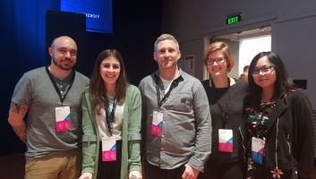
readOur trip to Semi Permanent 2018
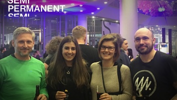
What do you get when you add 1 design conference, 2 days and 4 SilverStripe designers? A whole lot of inspiration! Dani Smith summarises some of the Semi Permanent 2018 experience.
readTeam Collaboration Discovery for CWP
Delivering the best user experience for SilverStripe CMS users requires ongoing research. This recently led us to conduct a discovery initiative on behalf of the CWP community.
read5 top tips for using Sketch
Discover how the design team at SilverStripe uses Sketch, as we break down our top 5 tips for streamlining your digital design workflow.
readThe Art of Archiving
Have you ever archived or deleted a page and then instantly thought, uh oh!? We certainly have, and that's why we've been working on improving the archive experience for CMS users. SilverStripe Designer Jared Lee, walks us through the ins and outs of archiving.
readProduct UX update
There is a team behind the scenes that continues to push for greater user experiences across the SilverStripe sites. Read what they have been working on and learn about some of their favourite tools for creating high quality user experiences.
readAccessibility is better for everyone
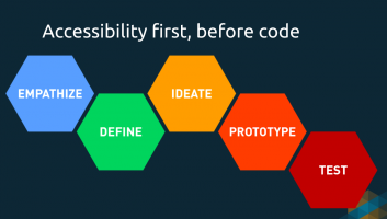
Making the web accessible to all should be top of mind when building a new site. Here are some key considerations to think about when taking on a new project, and some of the reasons why you should care about web accessibility.
readVideo: StripeCon NZ 2017 - John Milmine and Paul Clarke
We continue to release our series of StripeCon New Zealand 2017 videos, this time hearing from John Milmine of DNA and Paul Clarke from SilverStripe on the topic of content blocks.
readLittle White UX
Design is a lot like magic, as it can be used for both good and evil. SilverStripe Principal Designer James Ford, provides a fun and enlightening breakdown of the concept of dark patterns and how they are used to influence our behaviour.
readUX New Zealand 2017: A recap
A team of SilverStripe designers and developers recap their time at the UX New Zealand conference for 2017. Discover their favourite talks from the two day event, which brought together local and international speakers with a shared passion for better UX.
readTesting, testing, 1, 2, 3
A/B testing is the best way to figure out what marketing messages and creative content appeal to your audience the most. Learn how the SilverStripe Marketing team implement variant testing so you too can increase your website’s engagement and conversions.
readEnhancing user experience through typography
SilverStripe Graphic Designer, Dani Smith, discusses how to create the best user experience using the fundamentals of typographic design.
readDon’t reinvent the block
After extensive user research and feedback, a commercially supported SilverStripe module for content blocks is on its way. SilverStripe Principal Designer, Paul Clarke, talks us through what to expect.
readJoin the Research Panel to make SilverStripe tools even better
Here's your chance to help improve SilverStripe tools to ensure they work for you. Share your experience, and try out new features before they are released into the wild.
readWeb accessibility: do your sites meet the Standard?
Do you know how accessible your sites are? See the Web Accessibility Standard 1.0 and some tips to help you meet the Standard.
readGood bad design
Beauty, they say, is in the eye of the beholder. When it comes to the beauty of User Experience I would say it’s more objective, but the “look” of a website can blur the lines slightly.
read- Page 1 1(current)
- 2
- Next 10 entries


